Inspired by the big green leaves I was working on a few weeks ago, I’ve just been thinking about that wonderful bright green.
This is a bit of reverse inspiration. Generally, I work out ideas in smaller paper collages, then figure out how to use those ideas in a larger textile work. This time, the larger textile work is inspiring some smaller paper collages.
Starting with COLOR:
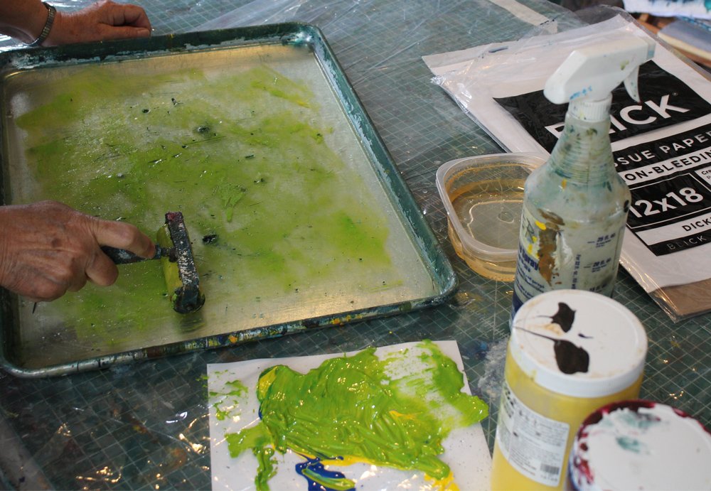
I’m looking for a bright, sunny green – a mix of blue and yellow, weighted to the yellow. Here’s my mixing space on my plastic drop cloth. (I have slipped a piece of white cardboard under the clear plastic so I can see the color accurately.)
Any time you mix a light color with a dark color, it helps to start with the lighter color (here – yellow) and mix the darker color into it just a little at a time. If you start with the dark and add light to it, it might take a long time to get to the color you want and you have to mix up too much.
I’ve got about two spoonfuls of yellow here to a little less than half a spoonful of blue. But, notice when it’s mixed, I still only used about half of the blue. A little goes a long way in this mix.
Now I’m inking up my gelatin plate. My goal will be to create some thin, tissue paper monotypes to use as collage backgrounds.
I’m pulling up a printed sheet to see what I get. It’s a loose, all-over parchment-look color. Just what I wanted.
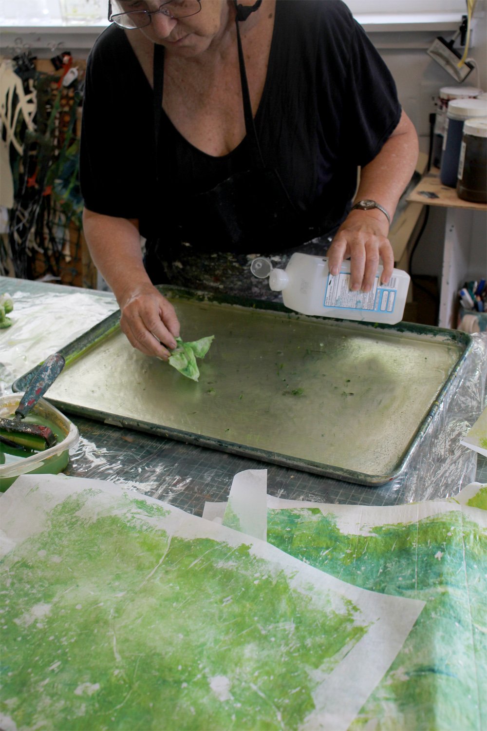
Clean up time. If you have watched monotype printing with gelatin plates on YouTube (there are MANY great videos available,) you’ll probably notice that they generally show the paper removing ALL of the acrylic paint of the gelli-plate. There’s nothing to clean. That does not happen for me. My homemade plate is slightly different consistency than the commercial ones. And, I am using super thin printing paper. So, some paint remains on the plate.
I wipe off the surface with a paper towel and a little water, then do a final wipe with rubbing alcohol. This keeps mold away. (My plate is stored non-refrigerated and I’ve been using this one for about a year now.)
Here are some of the papers I printed. I love the bright, watercolor-like transparency of the monotype printed pieces. For contrast, in the little cereal bowl is some blue I mixed up for another project that includes white in the mix.
That blue was a useful color mix, and adding white to a color can make it more pastel and also opaque. But, adding white is not the way to get the light, bright color. I find that brightness requires transparency.
At the end of this studio session, I began collaging the thin papers to watercolor sheets, which will be the substrate for the collage. I tape down the watercolor papers all four sides while I work, and generally work on two at once, side by side, as I have them here on my plywood sheet.
More to come on these projects. See ya next time.
For all the artmakers: Happy creating
For all the art lovers: Happy appreciating
Thank you for reading. I always enjoy questions and comments.
--Bobbi
How I keep in touch:
BLOG POSTS - once a week: Mostly about what I am creating in the studio. If you would enjoy receiving blog posts by e-mail, please subscribe here: I post and send by e-mail each Sunday evening. BLOGS-BY-EMAIL
NEWSLETTER – about once a month: Mostly news of exhibits and my way of introducing new work. You’ll get FIRST LOOKS at new artwork and members-only discounts. You’ll hear from me about once a month. NEWSLETTER


