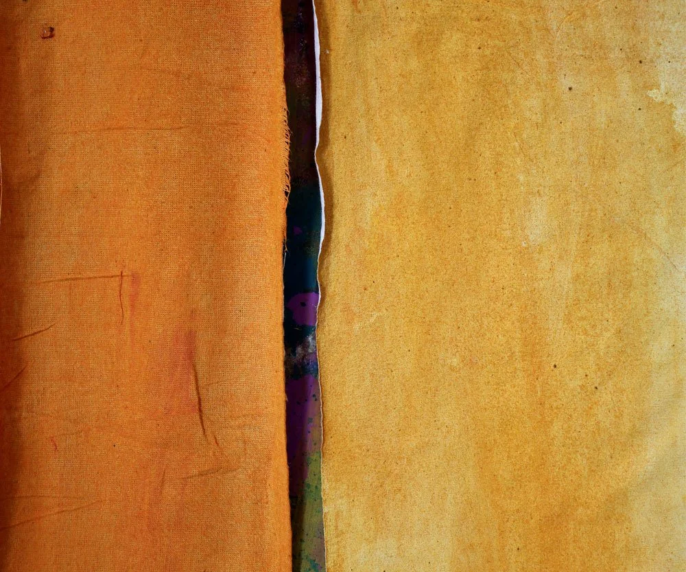
I have spent a few days this week in the studio working with orange hues.
Because I need a bit of magic “splash!”
I almost never create work with orange as the dominant all-over hue. Orange is pretty intense. But, when the dominant hue is something else, a little orange splash can be magic.
So here’s some work-in-progress; mixing up the color and how I plan to use it.
Mixing up the color:
My normal practice is to spoon out just what I’ll need and mix color on a disposable paper plate. Notice the ratio: So far on the plate, two heaping teaspoon of yellow. Then just a small portion of a teaspoon of red. I think that will be about right.
Tip: When mixing color, always start with the lightest, or less dominant color first. Then add the stronger color just a little at a time. This keeps you from mixing up way more than you need to get your final desired hue. Same procedure when mixing a hue into a transparent glaze. Your transparent-to-hue ratio may be as high as ten to one. Spoon out the transparent first, Then add the hue just a little bit at a time.)
Here’s the resulting color:
I will be painting three kinds of fabric, so that I can mix them up in my intended projects. First muslin.
The fabric that you put the paint on is one of the variables of the final appearance. The same paint on different kinds of fabric will look different. Like this.
On the left is the piece I sponge painted directly onto regular, untreated unbleached muslin. On the right, I sponge painted much the same onto a piece of muslin that I had pre-treated by gessoing it white. The fabric does not absorb as much color.
Now sheer polyester.
Painting sheer will create colors and patterns different from an opaque yardage like muslin. When you put it on a plastic drop cloth (a necessity, because a lot of the paint goes through to the surface below it) you will get interesting pools and patterns. If you use the sheer as a whole piece, this can be really interesting.
Now for some patterning. Once it was dry, I relief printed the orange pieces with wheat paste. Some circles. Some squares. Then I overpainted with a deep red.
Another tip: You can create colors that you will just fall in love with by experimenting with mixing two colors that are very similar. This red is a mix of cadmium red (which has a slightly orange-ish base) with alizarin crimson (which has a magenta-ish base.) The two together create wonderful red. You can do this with close-cousin blues or browns too.
Now let’s do some splashing.
Here is one of the transparent sheer pieces, cut out for collage and applique, placed into a work in progress. It’s a nice contrast to the surrounding blues and greens.
This one pops a little more. First, because the color on muslin is a little more intense than the color on sheer. And because the orange next to the strong aqua-teal makes both appear more intense.
A color is always affected by what it is next to.
Here is an underwater scene from “Nor Could Our Hands catch Them,” a completed work in my studio. The oranges and yellow are the complements of the blue-greens of the water. (You can learn more about this work on my website HERE)
Finally another way to get the colors to relate to each other is an overpainting with transparency.
This is a detail of a work-in-progress in the studio, a wetlands landscape. I love the way the underneath colors show through the transparent sun.
That’s it for orange. I hope you have an art-filled, creative week.
For all the artmakers: Happy creating
For all the art lovers: Happy appreciating
Thank you for reading. I always enjoy questions and comments.
--Bobbi
How I keep in touch:
BLOG POSTS - once a week: Mostly about what I am creating in the studio. If you would enjoy receiving blog posts by e-mail, please subscribe here: I post and send by e-mail each Sunday evening. BLOGS-BY-EMAIL
NEWSLETTER – about once a month: Mostly news of exhibits and my way of introducing new work. You’ll get FIRST LOOKS at new artwork and members-only discounts. You’ll hear from me about once a month. NEWSLETTER


